Plenty snow yesterday, eh?
Here in Lancaster County, we got 8 of the forecast 4-6 inches of snow yesterday. Tomorrow it's supposed to happen again -- the current forecast is for freezing rain, sleet, and snow starting early in the morning and going all day.
Today, though, it's sunny and warm (relative warm! not absolute warm!) and the sky is clear. (The roads down around the river, not so much.) It's a beautiful winter day: everything is white and round and sharp against the sky.
As we acknowledged last week, though: grey can be wonderful and the stark monochrome of winter is lovely in its way... but sometimes it can be a bit much. Sometimes it's just a little too grey, too white, too black. Sometimes you feel like it would be worth setting fire to your house just to see something other than white and grey.
So today, in hopes of avoiding such drastic measures, let's talk about color.
This post is going to be a basic run-down of how color works, what makes something look good, how to pick good accent colors, and some links to resources that we use often. I'm not going to touch too much on the stitch pattern/yarn color relationship -- come back next week for that!
First things first: what is color, anyway? Most people know that it's a physical property of an object: something that is blue reflects light in the wavelength range that we perceive as and call "blue," and it absorbs the rest of the light. Full-spectrum light hits an object and whatever wavelengths are reflected are the colors that we see.
Obviously, that can be affected by a lot of factors. Here at the shop, we encourage people to step out onto the porch with their yarn -- it's surprising how different colors can look under the shop lights and under the sun.
Here are the same four colors twice: once on the table in the shop, and once on the front porch. The difference isn't huge, but it's there:
Even if you're only looking for two colors that go together well, it's always a good idea to check out the combination under a few different lights. It's surprising, sometimes, which colors are related. Here's an idea of what factors could be in play -- I made a hexipuff out of a bit of Kettle Dyed a while ago, and we didn't know which color it was (it was an older color for which the dyer didn't have notes).
I took the hexipuff to the dyer and said "this is a great color. Make more." He looked at it and decided that it was mostly red, but had more orange than the other red we had in the shop, with maybe a little bit of purple in there too. He went back through a year's notes on the different colors that he has made, and found a possible contender: 70% red, 28% orange, and "a little bit" of purple. He tried it out the next day, and lo & behold, we had our great red again. (We have it now! It's awesome! Look!)
The good reason to check on your colors in different lights, then, is that relationships that are not apparent under indoor lighting may suddenly reveal themselves under natural light -- or vice versa. We didn't realize that there was purple in the hexipuff until we took it outside and held it up against a few differently-colored things; only then did we begin to think that it looked a little too rich to be just red and orange. Because of that little bit of purple, though, the red and purple look really, really good together:
Moving on to more technical things: I imagine that most of you are familiar with the color wheel. In short, they're a way to arrange the colors we perceive on a spectrum, saying "these are related, these are opposed, these are complementary." Below are two basic color wheels: a modern one and one from 1810, from Goethe's Theory of Colors, and a third, more complicated one from 1874, showing gradations from the "pure colors" into tints (colors + white) and shades (colors + black or grey).
"So," I hear you thinking, "How does this help me pick colors for my fair isle hat?"
Here is the short answer: pick a main color. If you have one contrast color, try going two points in either direction (I'm using the first color wheel above for reference here). If you're using green as your main color, blue or yellow will both look good as contrast colors. From there, it's always fun to go into the tints & shades color wheel -- bright green with dark blue? Dark, piney green with light yellow? Maybe the dark green with the bright green... there are all sorts of possibilities.
If you want more than two colors, it's always a good idea to have two that are closely related and one that pops out. An example: let's say you want a purple main color, as "violet" above. The next decision is whether you want the purple to read as a warm color (reddish or orangeish) or a cool one (blue/green). Let's say you want a warm one: a good second color would be one triangle over, a maroon or reddish-violet, because it's closely related to the purple, but different enough that it will stand out. And then a third color, one that really jumps out and draws attention to the piece: go over another two triangles and you'll have something directly related to CC #1. Purple, red-purple, and red-orange turns into a warm-toned, rich purple with a few really excellent, bright highlights.
If I'm making something with lots of colors (let's say five, for the sake of having a list to work with), I usually pick out one main color, two closely-related contrast colors, one slightly-less-related color, and one eye-catcher. Light green MC with a dark green and a sage, maybe, then a yellow-green for the second set of contrast colors, and a bright, electric blue for the eye-catcher:
This is a good tool for figuring out how colors work together. Click on colors on the right (up to five) and the search engine looks through Flickr for photos that contain that color. You can adjust the percentages (as I did for the image above) to give it a main color and contrast colors. It's a little limited -- it works best for color selections that are mostly one color (mostly greens, for example), and once you have four or five colors it sometimes breaks and gives you pictures that aren't mostly those colors. Still, it's a great place to start.
It's also a good way to start thinking about accent colors -- if you enter three or four colors that are closely related, it can give you an idea about which other colors stand out enough to be used as accents.
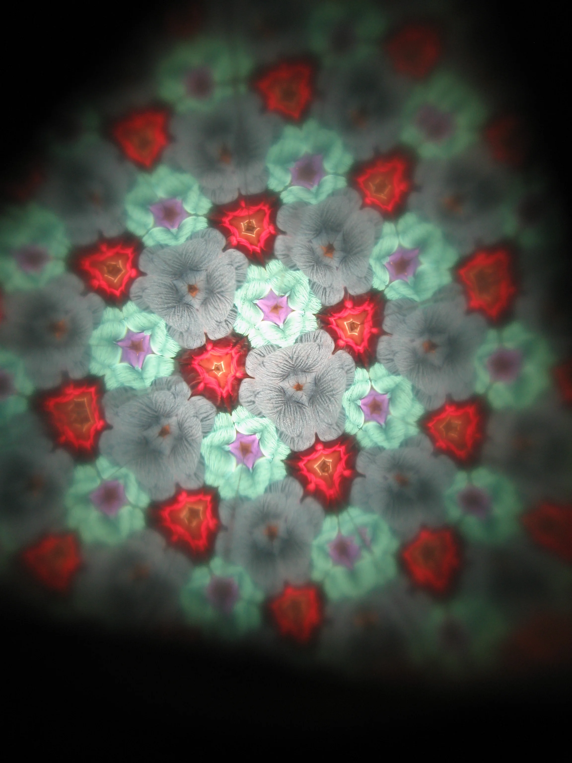
Here at the shop, you may have noticed that we have a basket full of kaleidoscopes. Ever wonder why?
It's because of accent colors. You'd look at that basket of blue and purple and say "great, but I would never ever use that bright red for an accent. That looks terrible." The kaleidoscope messes up what your brain thinks it's looking at -- it takes it from "six skeins of yarn" to "blue teal purple dark green turquoise red." It interrupts what your brain thinks it knows about the colors and whether or not they go together, and it reveals that they do, in fact, look great together.
You wouldn't want to use too much red, of course. That's why it's an accent color.
Last but not least, here's my new favorite color tool on all of the internet: the color scheme designer.
Here it is with this year's official color selected (that's it in the center box on the right) (yes, this is a real thing).
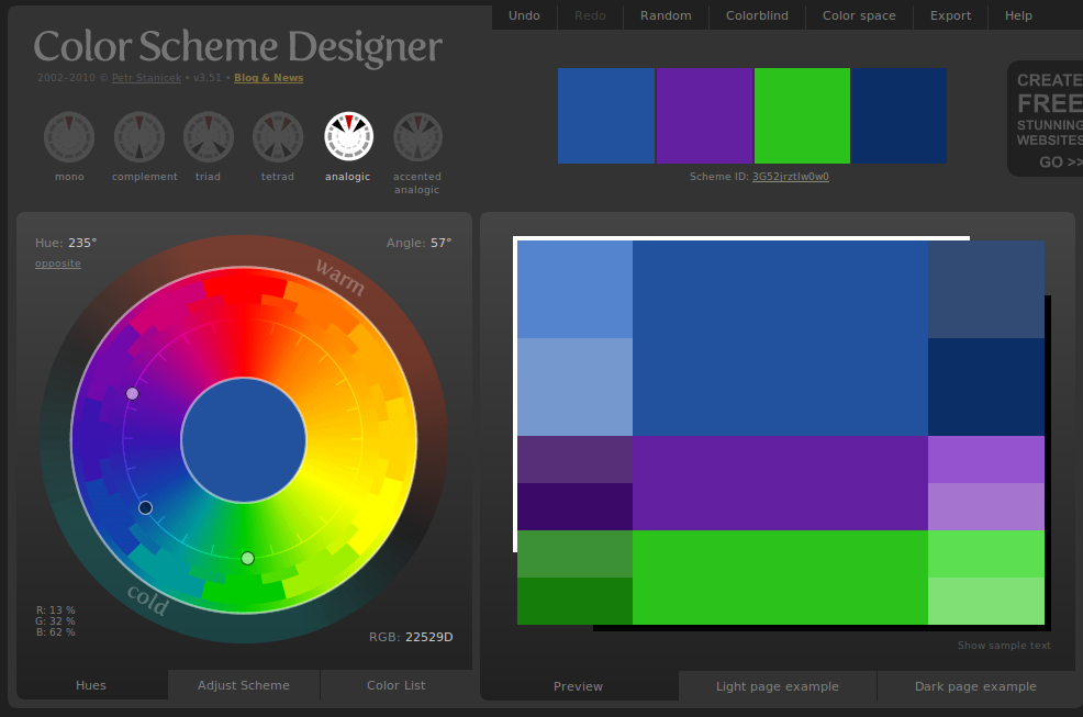
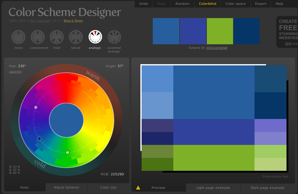
To use: select a color. You can adjust the saturation & tint/shade by clicking "adjust scheme" under the wheel. A single color selection will give you something like the above. By picking "complement," "triad," "tetrad," etc., you can get multiple-color schemes, and the accent colors can be moved around, so you can customize it however you like. It also has a colorblindness filter, so if you're making something for someone colorblind (or if you just find it fascinating, like I do) you can play with that as well. Here's an analogic color scheme based on blue (the center dot) in full-color and most-common-form-of-colorblindness:
Thus concludes today's lesson... now go out and enjoy the snow before it turns to icy slush tomorrow!


