"So," I hear you thinking, "How does this help me pick colors for my fair isle hat?"
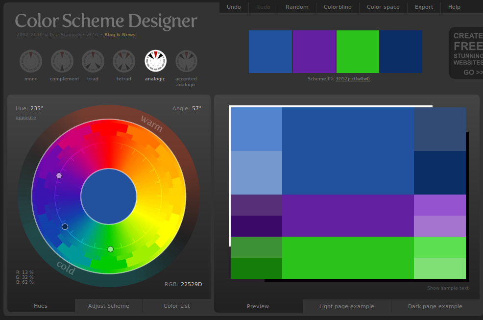
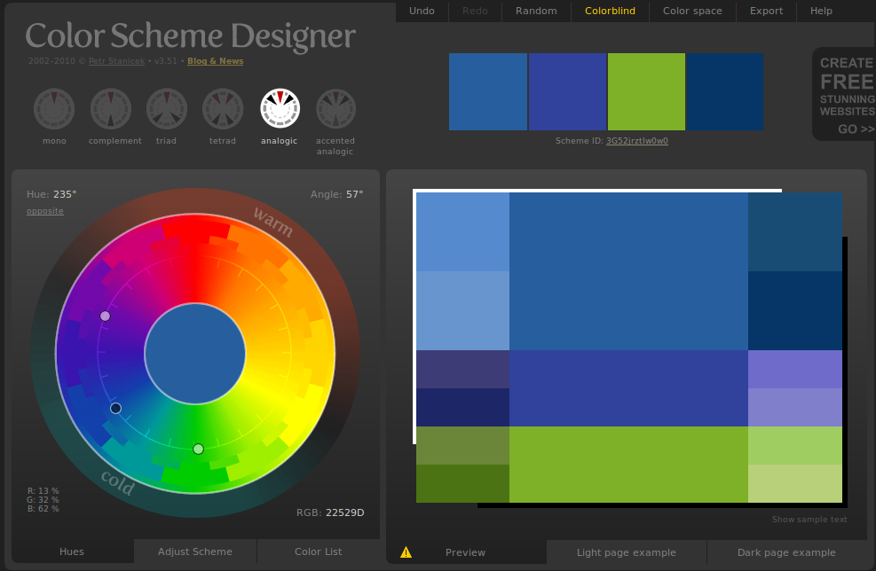
Here is the short answer: pick a main color. If you have one contrast color, try going two points in either direction (I'm using the first color wheel above for reference here). If you're using green as your main color, blue or yellow will both look good as contrast colors. From there, it's always fun to go into the tints & shades color wheel -- bright green with dark blue? Dark, piney green with light yellow? Maybe the dark green with the bright green... there are all sorts of possibilities.
If you want more than two colors, it's always a good idea to have two that are closely related and one that pops out. An example: let's say you want a purple main color, as "violet" above. The next decision is whether you want the purple to read as a warm color (reddish or orangeish) or a cool one (blue/green). Let's say you want a warm one: a good second color would be one triangle over, a maroon or reddish-violet, because it's closely related to the purple, but different enough that it will stand out. And then a third color, one that really jumps out and draws attention to the piece: go over another two triangles and you'll have something directly related to CC #1. Purple, red-purple, and red-orange turns into a warm-toned, rich purple with a few really excellent, bright highlights.
If I'm making something with lots of colors (let's say five, for the sake of having a list to work with), I usually pick out one main color, two closely-related contrast colors, one slightly-less-related color, and one eye-catcher. Light green MC with a dark green and a sage, maybe, then a yellow-green for the second set of contrast colors, and a bright, electric blue for the eye-catcher: